Effect of Covid-19 on Bike Rentals
Background
Covid-19 had a huge impact on the world by putting people in a situation they have never been in before. Hit by a global pandemic, people were asked to isolate and reduce interactions to a minimum. Some countries even imposed a lockdown that prohibited people from leaving their apartment except for really necessary purposes, such as buying groceries.
As a consequence, streets were empty and people were generally afraid of catching the virus by touching public surfaces. As London has a very sophisticated infrastructure of renting bikes, I was wondering how the pandemic impacted the rental of bikes.
My hypothesis had been that numbers must have dropped tremendously, as people didn’t want to use a bike that has been used by numerous people before in fear of catching Covid-19. To analyze this matter further, I downloaded data from TfL about daily bike rentals and produced several graphs to generate insights into the impact of Covid-19 on bike rentals.
Data Analysis
Loading Libraries
library(tidyverse)  # Load ggplot2, dplyr, and all the other tidyverse packages
library(ggthemes)
library(skimr)
library(janitor)
library(vroom)
library(httr)
library(readxl)
library(lubridate)
Downloading Data
Plot a distribution graph of bike rentals by month and year
bike %>%
  #Only include data after 2015
  filter(year >= 2015) %>%
  #Plot graph
ggplot(aes(x=bikes_hired))+
  geom_density()+
  #Plot separately for each month and year
  facet_grid(year~month)+
  #Change x-axis labels
  scale_x_continuous(breaks=seq(20000,60000,20000),labels = function(x) paste0(x/1000, "K"))+
  #White background
  theme_minimal()+
  #Chart and axis title
  labs(
    title = "Distribution of daily bike rentals by month and year",
    x = "Daily bike rentals",
    y = "Density"
  )+
  theme(axis.text.x = element_text(size = 7))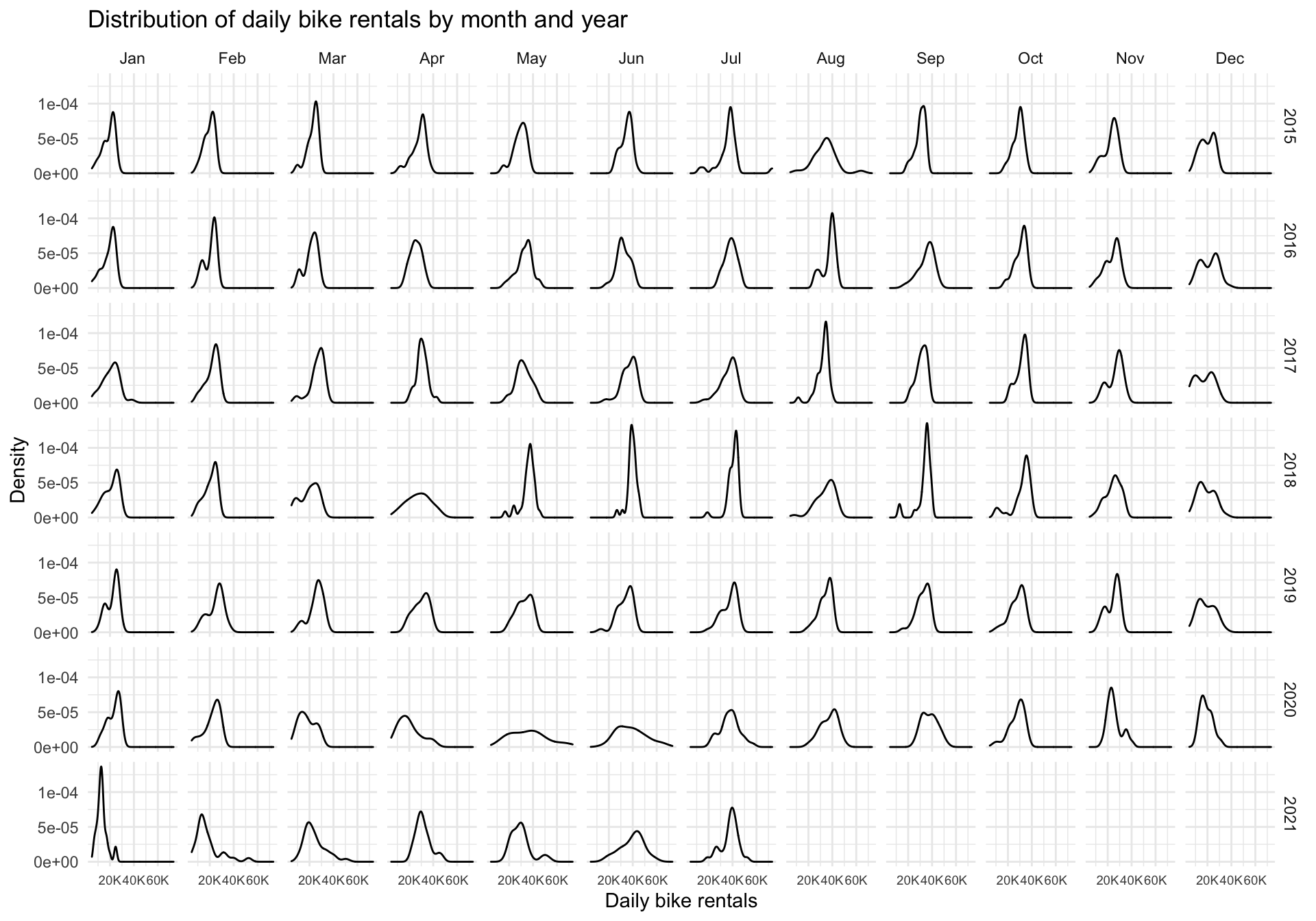
Looking at the graph, it can be observed that curves are flattening between March and June 2020 compared to previous years, implying larger variances in the number of bikes rented on a given day. In early 2020 Covid-19 hit the world and the first wave of infections arrived around March and April 2020. As previously mentioned, people were put in an unprecedented situation with living through a pandemic. Many people were afraid to go out, in fear of catching the virus, the consequences of which have not yet been fully researched.
People have lost their daily rhythm by being locked in and working remotely. In previous years, the curve was pretty steep and peaked at around 30k or 40k bikes rented per day, as people probably used them to get to work, but during the first Covid wave that has changed. People used bikes more infrequently and therefore flattening the distribution.
After more about Covid-19 became known and the lockdown was nullified, people started getting back into their daily rhythm. The curve was getting steeper and started clearly peaking between 30k and 40k bikes. However, comparing 2021 to previous years (2015-2019), it is obvious that people still have more variability in renting bikes. This could be due to the fact that people are working more from home and therefore don’t need to rent bikes to get to work.
While it is interesting to see a larger variance in bike rentals, it would be nice to see how the actual number of bikes rented has changed due to Covid-19. That’s what we will do in the next section.
Monthly changes in TfL bike rentals
In this section, we will have a look at how the average daily bike rental by month compares to the average by month measured between 2016-2019.
#Compute expected average bike rentals in each month
exp_bikes_per_month <- bike %>%
  filter(year %in% 2016:2019) %>%
  group_by(month) %>%
  summarize(
    monthly_average = mean(bikes_hired)
  )
#Compute actual average bike rentals per month
actual_bikes_per_month <- bike %>%
  filter(year>=2016) %>%
  group_by(year, month) %>%
  summarize(
    act_monthly_average = mean(bikes_hired)
  )
#Merge actual and expected bike rental in one dataframe
bikes_per_month <-
  left_join(actual_bikes_per_month, exp_bikes_per_month, by="month")

#Compute discrepancies in actual and expected bike rentals
bikes_per_month <- bikes_per_month %>%
  mutate(
    excess_rentals = act_monthly_average - monthly_average,
    up = ifelse(act_monthly_average>monthly_average, excess_rentals, 0),
    down = ifelse(act_monthly_average<monthly_average, excess_rentals, 0)
  )

#Draw graph
ggplot(bikes_per_month, aes(x=month, group = year))+
  geom_line(aes(y=act_monthly_average),size=0.4, color="#333333")+
  geom_line(aes(y=monthly_average), size=1, color="blue") +
  facet_wrap(~year)+
  theme_minimal()+
  geom_ribbon(aes(ymin=monthly_average,ymax=monthly_average+up),
              fill="#7DCD85",alpha=0.4)+
  geom_ribbon(aes(ymin=monthly_average+down,ymax=monthly_average),
              fill="#CB454A",alpha=0.4)+
  labs(
    title="Monthly changes in TfL bike rentals",
    subtitle="Change from monthly average
shown in blue and calculated between 2016-2019",
    y="Bike rentals",
    x="",
    caption = "Source: TfL, London Data Store"
  )+
  theme(plot.title = element_text(size=14),
        plot.subtitle=element_text(size = 12),
        axis.title.y = element_text(face="bold", size=10),
        axis.text.x = element_text(size=9),
        axis.text.y = element_text(size=10),
        plot.caption = element_text(size=8),
        strip.text = element_text(size=8)
        )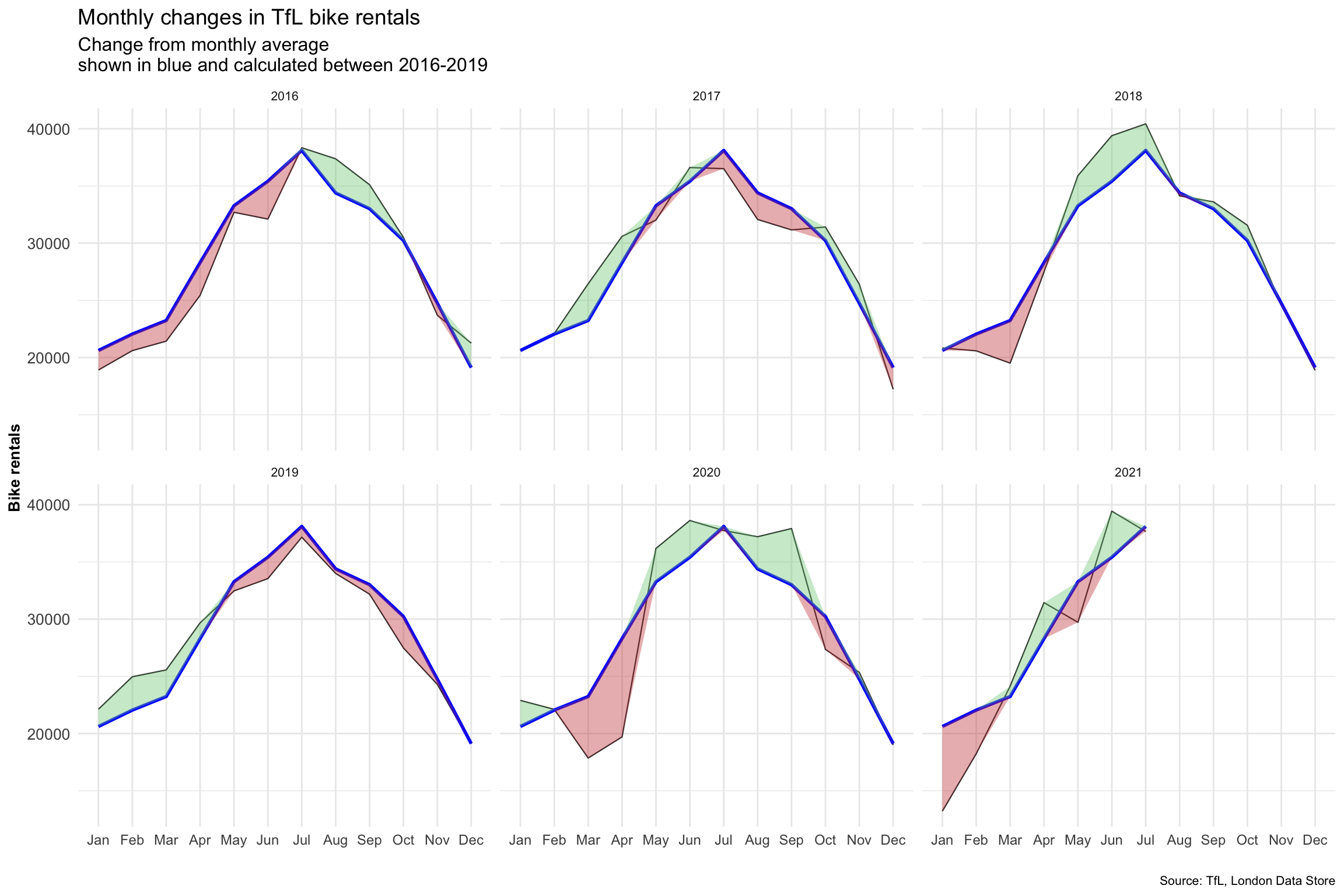
The graph display the average daily bike rentals by month measured between 2016 and 2019 as the blue line, and the actual average daily bike rentals for each month using the black line. Whenever the actual values are higher than the 2016-2019 average, the area between the two curves is colored green. When the actual value is below the 2016-2019 average, the area is colored red.
Jumping straight to 2020, we can actually discover that bike rentals were much lower during the first Covid-19 wave than the average monthly bike rental measured between 2016 and 2019. However, in May bike rentals started picking up pace and were higher than the average from previous years. This is interesting, as distribution curves were really flat in May and June 2020, but people were actually using the bikes despite the pandemic. An explanation for this could have been people not wanting to use the Tube and therefore deciding to stay at the fresh air and use a bike instead.
However, looking at 2021, bike rentals in May and June were lower than the measured average between 2016 and 2019, which can be led back to the lockdown the United Kingdom was experiencing.
This data analysis was conducted on a month basis, but we can dig even deeper by having a look at weekly values. Let’s do a similar analysis to before, but this time we will visualize the deviation (%) of average daily bike rentals by week from the weekly averages measured between 2016 and 2019.
Weekly changes in TfL bike rentals
#Compute expected weekly average bike rentals in each month
exp_bikes_per_week <- bike %>%
filter(year>=2016 & year <=2019) %>%
group_by(week) %>%
summarize(
weekly_average = mean(bikes_hired)
)
#Compute actual average bike rentals per week
actual_bikes_per_week <- bike %>%
filter(year>=2016) %>%
group_by(week,year) %>%
summarize(
act_weekly_average = mean(bikes_hired)
)
#Merge actual and expected bike rental in one dataframe
bikes_per_week <-
left_join(actual_bikes_per_week, exp_bikes_per_week, by="week")
#Compute discrepancies in actual and expected bike rentals. In addition,
#take out week 53 for 2021.
bikes_per_week <- bikes_per_week %>%
filter(!(week==53 & year==2021)) %>%
mutate(
excess_rentals = (act_weekly_average - weekly_average) / weekly_average,
up = if_else(excess_rentals>0, excess_rentals,0),
down = if_else(excess_rentals < 0, excess_rentals,0)
)
#Plot graph
ggplot(bikes_per_week,aes(x=week))+
geom_line(aes(y=excess_rentals), size=0.2)+
facet_wrap(~year)+
theme_minimal()+
geom_ribbon(aes(ymin=down,ymax=0),
fill="#CB454A",
alpha=0.4)+
geom_ribbon(aes(ymin=0, ymax=up),
fill="#7DCD85",
alpha=0.4)+
geom_rug(data=subset(bikes_per_week, excess_rentals > 0),
sides="b",
color="#7DCD85")+
geom_rug(data=subset(bikes_per_week, excess_rentals < 0),
sides="b",
color="#CB454A")+
annotate(geom = "rect", xmin = 14, xmax = 26, ymin = -Inf, ymax = Inf, fill = "grey", alpha=0.3)+
annotate(geom = "rect", xmin = 40, xmax = 52, ymin = -Inf, ymax = Inf, fill = "grey", alpha=0.3)+
scale_y_continuous(breaks=seq(-0.5,1,0.5),labels=function(x) paste0(x*100, "%"),limits=c(-0.6,1))+
scale_x_continuous(breaks=seq(0,53,13),labels=c("","13", "26", "39", "53"))+
labs(
title="Weekly changes in TfL bike rentals",
subtitle="% change from weekly averages
calculated between 2016-2019",
y="",
x="week",
caption = "Source: TfL, London Data Store"
)+
theme(plot.title = element_text(size=14, face="bold"),
plot.subtitle=element_text(size = 12, face="bold"),
axis.title.x = element_text(face="bold", size=12),
axis.text.x = element_text(size=8),
axis.text.y = element_text(size=8),
plot.caption = element_text(size=8),
strip.text = element_text(size=10)
)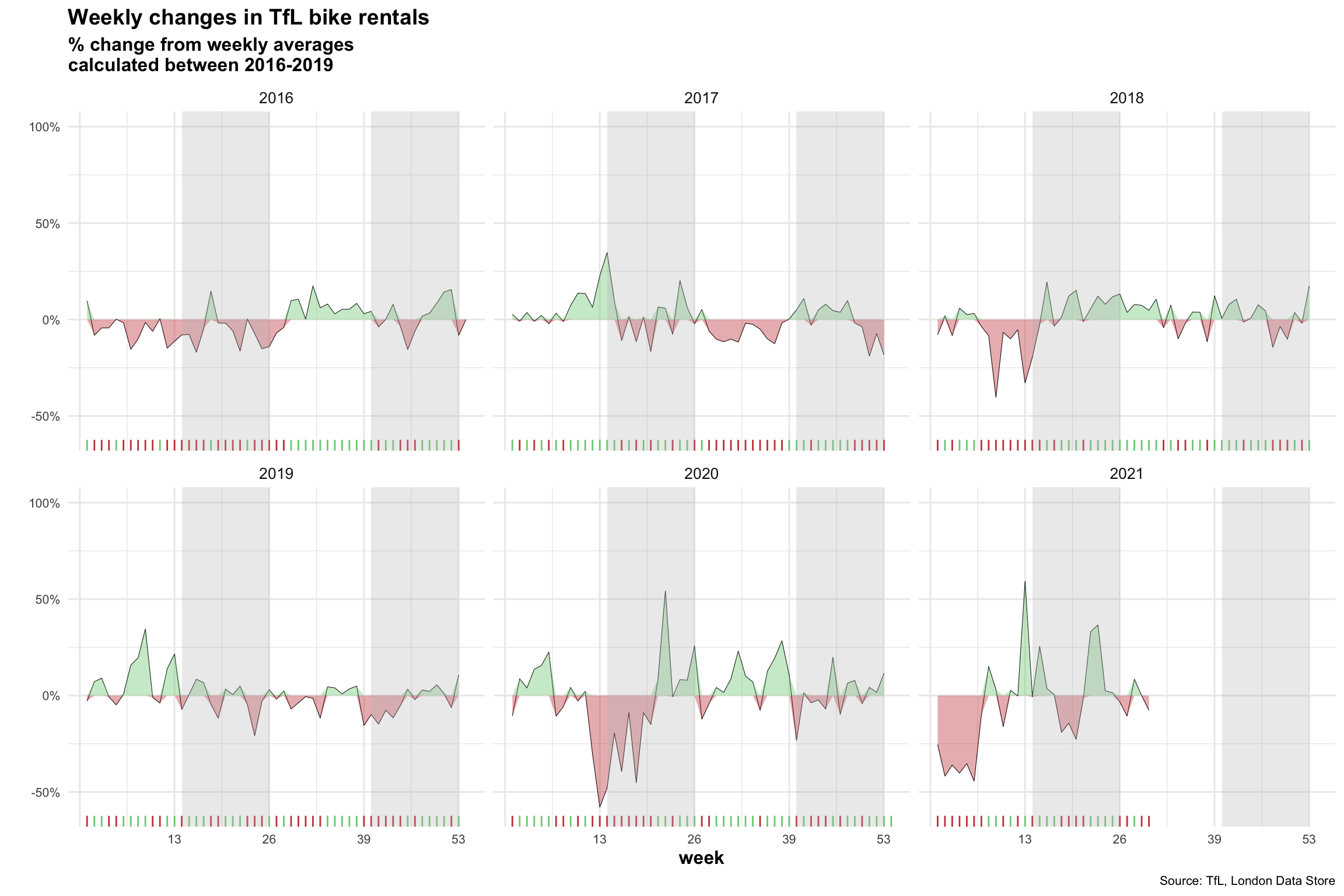 Jumping straight again to 2020, we can actually see that Covid-19 had a severe impact on bike rental. The first few weeks in 2020, where Covid first hit the population in the UK, bike rentals dropped tremendously, as shown by the red area around week 13. This agrees with the previously generated graph that displayed a reduction in bike rentals around March and April 2020. Then again, as seen in the previous graph, bike rentals increased around May (week 20) and went above the average bike rental from previous years.
Looking at 2021, the first 10 weeks of 2021 went quite bad for bike rental, probably due to another lockdown in the UK.
Summary of findings
The Covid-19 pandemic definitely had its effect on bike rentals in London. When the first wave hit the UK, bike rentals went down by a lot, probably in fear of catching the virus and also the reduced need to use a bike to get to work. However, people quickly recovered from the initial fear and started using bikes after the first wave more than in the previous years. This could potentially be led back to the fact that people didn’t want to use the subway, but rather stay at the fresh air with a bike, since the risk of catching the Covid virus is much lower.
It is generally very obvious that the deviation in daily bike rentals increased a lot since the pandemic, as people go into lockdowns, which reduces the number of rentals, but are overly enthusiastic when a lockdown ends and explore the city with bikes much more than before.