Trump Votes vs. Vaccination Status by U.S. County
Background
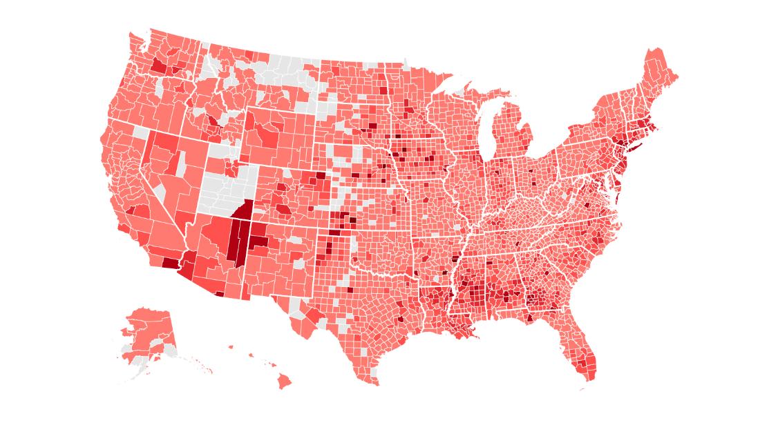
During my time at LBS, our professor provided us with an article (The Racial Factor: There’s 77 Counties Which Are Deep Blue But Also Low-Vaxx. Guess What They Have In Common?) that compared the % of Trump votes in each US county with the respective % of population (by county) that is fully vaccinated against Covid-19. The graph was intended to generate some insights regarding the willingness of Trump voters towards being vaccinated against Covid-19. Furthermore, the graph looked at the population of each county, as larger counties usually have a bigger influence on elections, as well as on fighting Covid-19.
The graph generated some really interesting insights and I decided to reproduce the graph by using R coding.
Data Analysis
Before I was able to conduct any analysis, I had to collect data by using three different sources:
1. Vaccination by county: CDC data
2. Election Results: County Presidential Election Returns 2000-2020
3. Population estimate: Population by county
Loading Libraries
library(tidyverse)
library(ggthemes)
library(skimr)
library(janitor)
library(vroom)
Downloading data
# Download CDC vaccination by county
cdc_url <- "https://data.cdc.gov/api/views/8xkx-amqh/rows.csv?accessType=DOWNLOAD"
vaccinations <- vroom(cdc_url) %>%
  janitor::clean_names() %>%
  filter(fips != "UNK") # remove counties that have an unknown (UNK) FIPS code

# Download County Presidential Election Returns
# https://dataverse.harvard.edu/dataset.xhtml?persistentId=doi:10.7910/DVN/VOQCHQ
election2020_results <- vroom(here::here("data/countypres_2000-2020.csv")) %>%
  janitor::clean_names() %>%

  # just keep the results for the 2020 election
  filter(year == "2020") %>%

  # change original name county_fips to fips, to be consistent with the other two files
  rename (fips = county_fips)

# Download county population data
population_url <- "https://www.ers.usda.gov/webdocs/DataFiles/48747/PopulationEstimates.csv?v=2232"
population <- vroom(population_url) %>%
  janitor::clean_names() %>%

  # select the latest data, namely 2019
  select(fips = fip_stxt, pop_estimate_2019) %>%

  # pad FIPS codes with leading zeros, so they are always made up of 5 characters
  mutate(fips = stringi::stri_pad_left(fips, width=5, pad = "0"))
The plan is to setup 3 separate dataframes for population, vaccination rate and election results and ultimately merging the dataframe by using the fips variable. Before joining the dataframes, I had to clean the data and make sure it has exactly the information I need for my analysis.
Clean and prepare election data
First, a new dataframe needs to be created to only include Donald Trump votes. Subsequently, the number of votes needs to be expressed as a percentage of the overall votes for each district/county.
# First we filter the dataset only for Donald Trump votes
election_trump <- election2020_results%>%
  filter(candidate =="DONALD J TRUMP")

#Let's have a look at the dataset to scan for duplicates
skim(election_trump)

#By looking at the dataset, we can discover that there are only 3153 unique fips,
#even though the dataset hat more than 5000 rows. By looking at the mode,
#we can see that there are 16 different ways of voting,
#which is where the duplicate entries are coming from. We need to add them up.

election_unique <- aggregate(candidatevotes~fips,data=election_trump, FUN="sum")

#As we lost the total votes for each county by filtering for, we need to add them back again by using left_join().
election_unique_join <- unique(inner_join(election_unique,
                        election2020_results[c("fips", "totalvotes")], by="fips",
                        copy=FALSE))

#Calculate the percentage of people voting for Trump
election_percentage<- election_unique_join%>%
  mutate(
    vote_percentage=candidatevotes/totalvotes
  )

#Slice dataframe to only include Fips and the vote percentage per county
election_trump_filtered <- election_percentage %>%
  select(fips, vote_percentage)

#Quick look at the finished dataframe
skim(election_trump_filtered)
Clean and prepare vaccination data
A new dataframe is created that only contains the county and percentage of population being fully vaccinated on September 2 (last available date).
#First look at the dataset shows us that there are counties with no
#vaccinated people at all, which is strange.
skim(vaccinations)

#Let's find out where those zeros are coming from
vaccinations %>%
  filter(series_complete_pop_pct==0) %>%
  count(recip_state, sort=TRUE)

#Most of the zeros seem to be coming from Texas, so let's have a closer look at
#the state Texas
vaccinations %>%
  filter(recip_state=="TX")

#The rows for Texas are filled with zeros, implying no data is being recorded for
#Texas. By looking at the CDC database online, it can be seen that Texas provides
#aggregate dose count on a national level instead of individual doses.
#Therefore, no data is available for Texas. As other counties also had no data
#available, we'll simply take out all counties with a vaccination rate of 0%.

#Filter for the last available date and take out rows were no data was recorded.
vaccinations_recent <- vaccinations %>%
  filter(date=="09/02/2021", series_complete_pop_pct!=0)

#Check for values that don't seem reasonable where vaccination percentage is
#comparatively low
vaccinations_below10 <- vaccinations_recent %>%
  filter(series_complete_pop_pct <=10)

#By looking at the skim function below, we can see that 102 states have less than or
#equal to 10% of the population vaccinated, which is quite low. But those values
#are still valid and need to be included.
skim(vaccinations_below10)

#Select only fips and vaccination percentage, as we only need those to construct
#the dataframe that will ultimately build the graph
vaccinations_fips <- vaccinations_recent %>%
  select(fips, series_complete_pop_pct)

#Convert vaccination percentage in numerical percentage to adjust it to the other
#dataframe with the election results
vaccinations_fips$series_complete_pop_pct <-
  vaccinations_fips$series_complete_pop_pct/100

#Quick look at the final dataframe
skim(vaccinations_fips)
Merging the 3 dataframes (tibbles) into 1
As all dataframes have been prepared to include the necessary data, they can now be joined by using inner_join().
#Merge vaccination and trump votes
vaccination_vote <- inner_join(vaccinations_fips, election_trump_filtered,
                              by="fips", copy=FALSE)

#Add population numbers
vacc_vote_pop <- inner_join(vaccination_vote, population, by="fips", copy=FALSE)

#Omit all rows with any NA values
vacc_vote_pop <- na.omit(vacc_vote_pop)
Draw the graph
ggplot(vacc_vote_pop, aes(x=vote_percentage, y=series_complete_pop_pct,
                          size=pop_estimate_2019))+
  geom_point(alpha=0.3)+
  geom_smooth(method = "lm")+
  theme_bw()+
  #Add 5 horizontal lines
  geom_hline(yintercept=0.539, linetype="dashed",
                color = "black", size=1)+
  geom_hline(yintercept=0.85, linetype="dashed",
                color = "black", size=1)+
  geom_hline(yintercept=0.508, linetype="dashed",
                color = "black", size=1)+
  geom_hline(yintercept=0.4, size=1)+
  geom_hline(yintercept=0.6,size=1)+
  #Add 2 vertical lines
  geom_vline(xintercept=0.4,size=1)+
  geom_vline(xintercept=0.6,size=1)+
  #Put labels according to graph pictured
  annotate("text", x=0.08, y=0.56, label="TARGET: 53.9%", color = "blue", size=3)+
  annotate("text", x=0.13, y=0.87, label="Herd immunity threshold (?)",
           color = "blue", size=3)+
  annotate("text", x=0.08 , y=0.52, label="ACTUAL: 50.8%", color = "blue", size=3)+
  annotate("text", x=0.5, y=0.95, label="EVERY U.S. COUNTY", color="black", size=8)+
  theme(panel.grid.major = element_line(colour = "grey80"), legend.position = "none", plot.title=element_text(hjust=0.5))+
  labs(
    title="COVID-19 VACCINATION LEVELS OUT OF POPULATION BY COUNTY",
    x="2020 Trump Vote %",
    y="% of Total Population Vaccinated"
  ,size=7)+
  #Change scale to comply with picture
  scale_y_continuous(breaks=seq(0,1,0.05),labels=function(x) paste0(x*100, "%"),
                     expand=c(0,0), limits=c(0,1))+
  scale_x_continuous(breaks=seq(0,1,0.05),labels = function(x) paste0(x*100, "%"),
                     expand=c(0,0), limits=c(0,1))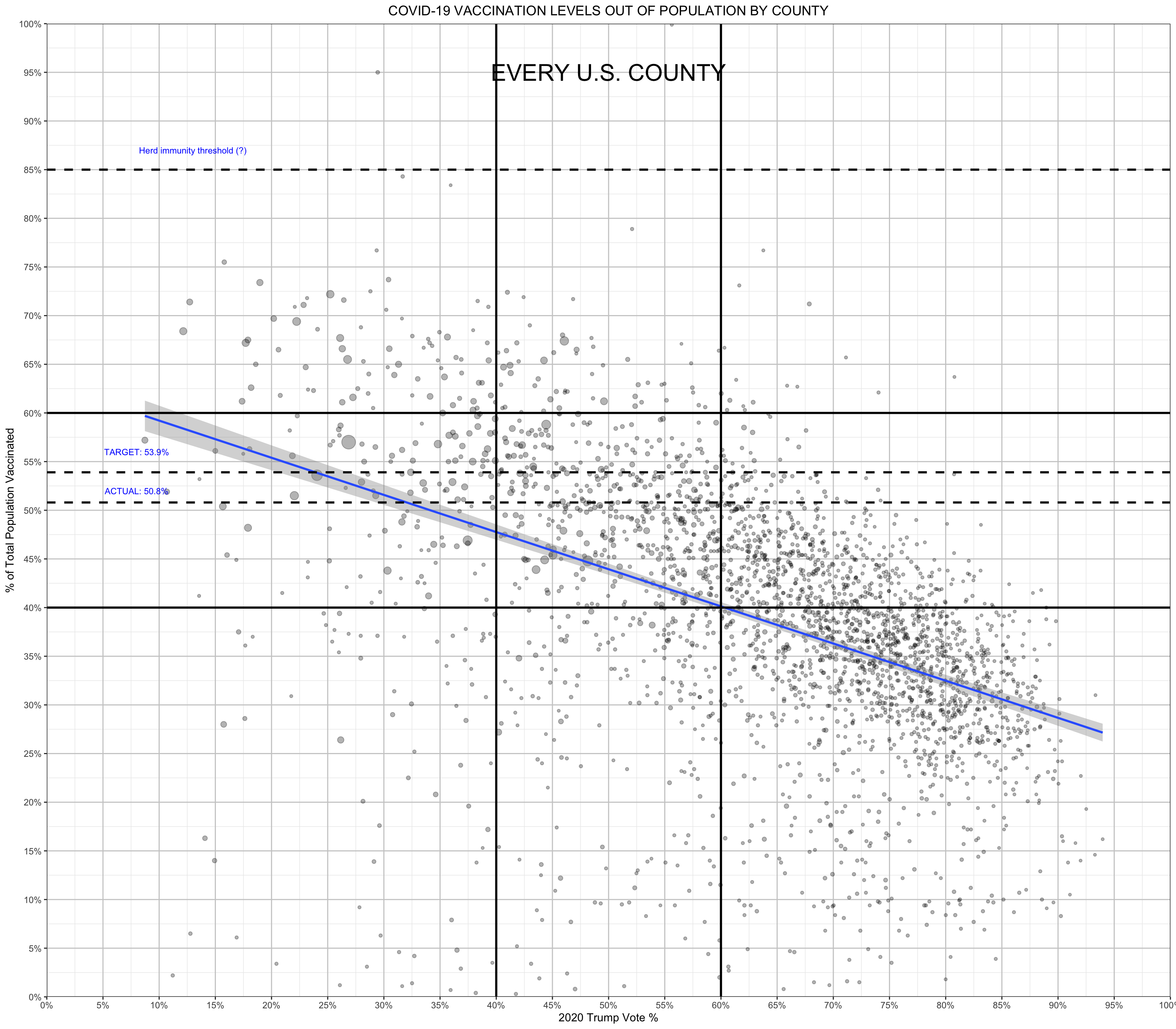
Summary of findings
The graph shows a negative correlation between Trump votes and the vaccination status. More precise, in counties with more trump voters, a comparably lower proportion of the population is fully vaccinated against Covid-19. Hence, Trump voters seem to be rather reluctant to Covid-19 vaccinations.
Furthermore, we can see that only very few counties are above the herd immunity threshold, while many counties still have less than 5% of the population vaccinated.
The points are proportional in size to the county population, therefore, larger points display larger counties. Looking at the graph, we see a lot of large counties are clustered around 50% vaccination status and therefore often above the target of 53.9%. Also, most of the large counties were rather against Trumpm with often less than 40% of the population voting for Trump.