ggplot2
Introduction
When it comes to analyzing data, ggplot is one of the most powerful packages. It is used for generating graphs and visualizing trends. A multitude of different graphs is readily available and easily customizable within the ggplot package.
The ggplot package is part of the tidyverse library and is automatically included when loading tidyverse. However, it can also separately be called using library(ggplot2).
In the following sections, I will provide a brief introduction to ggplot and the different types of graphs and customization it offers. Naturally, there are many more features to it, but I will only provide a basic overview of its use cases. For more details, please visit ggplot2.
General Setup
Before choosing the type of graph you want the data to be displayed in, you have to initiate ggplot by calling ggplot() and providing the so-called aesthetics, which specify values on x-axis and y-axis.
Note: Some charts don’t require a y-value, as they provide distributions of only one specific variable.
Aesthetics also provide the opportunity to color or size items according to specific characteristics.
The initiation of ggplot itself doesn’t provide any output. By adding more functions we can add points, lines, etc. to the graph.
The basic initiation looks the following way: ggplot(data, aes(x = x-variable, y = y-variable))
Scatter Plot
A scatter plot is very useful for examining relationships between two variables. It shows the effect of an independent variable (x) on a dependent variable (y).
We can tell ggplot to draw a scatter plot by adding geom_point() after initizalizing ggplot().
Let’s say we have a dataset for employees that includes their salary, experience, gender, and more. If we want to analyse the relationship between experience and salary we can draw the following scatter plot:
#Initiate ggplot
ggplot(data_employees, aes(x=experience, y=salary))+
  #Add geom_point
  geom_point()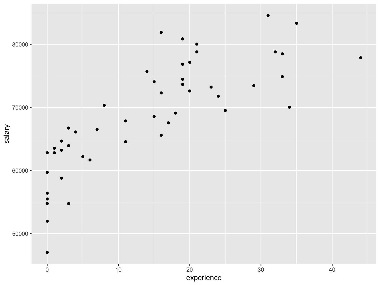
As you can see, this is a very basic scatter plot without a title and only the variable names on the x- and y-axis. By using the function labs we can specify the plot and axis titles.
#Initiate ggplot
ggplot(data_employees, aes(x=experience, y=salary))+
  #Add geom_point
  geom_point()+
  #Add titles
  labs(
    title = "Relationship between experience and salary",
    x = "Experience (in years)",
    y = "Salary (in USD)"
  )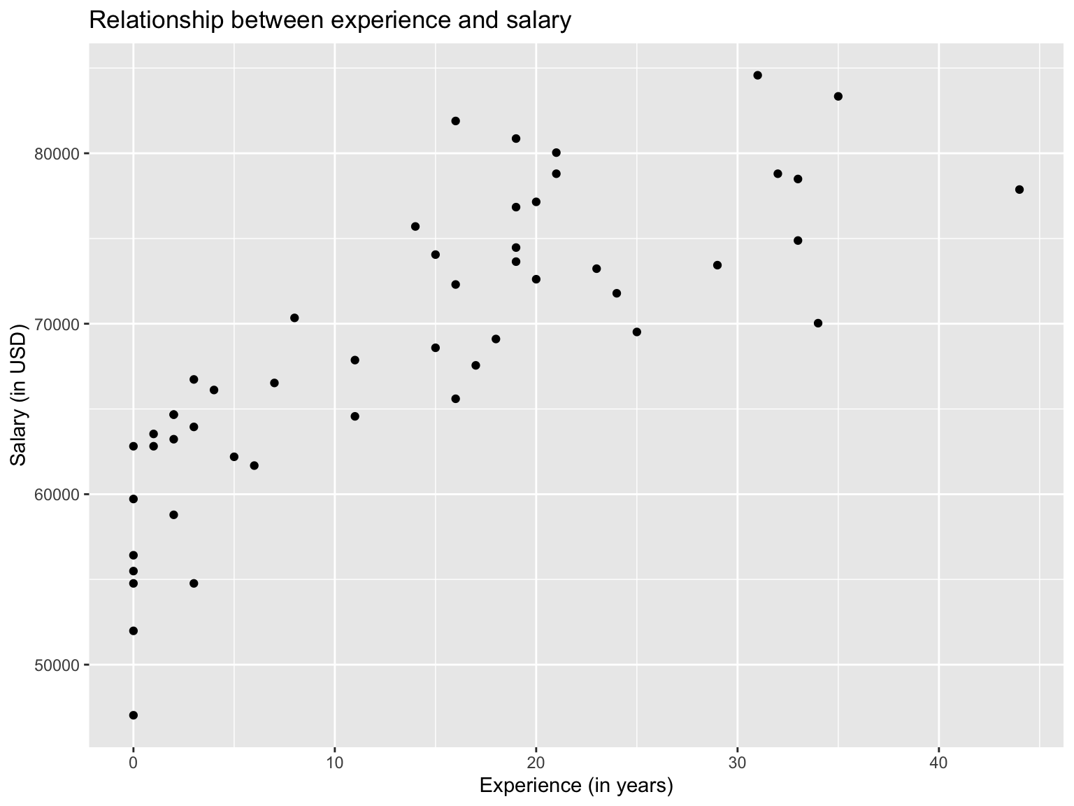
This looks already better, but we can tune the graphs even further by adding additional arguments and functions.
To be able to make better inferences, we can add a trend line by adding the function geom_smooth(method=lm). The geom_smooth function usually returns a grey background in addition to the trendline which represents the confidence interval. By adding the argument se=FALSE, it can be turned off.
Or we could color the points according to the gender of the employee by including the argument color = gender in the ggplot initialization.
Let’s see what a scatter plot would look like with a trendline and color according to gender:
ggplot(data_employees, aes(x=experience, y=salary, color=gender))+
  #Add geom_point
  geom_point()+
  #Add titles
  labs(
    title = "Relationship between experience and salary",
    x = "Experience (in years)",
    y = "Salary (in USD)",
  )+
  #Adding a trendline, without confidence intervals
  geom_smooth(method = lm, se=FALSE)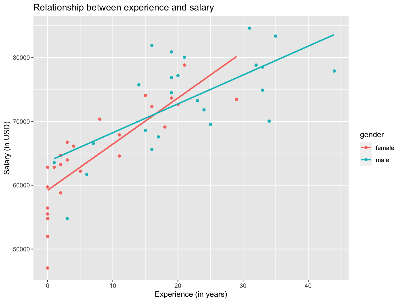
This graph provides much more insights than the previous graphs. We can see that for both male and female employees, salary increases with experience, whereas the correlation is stronger for female employees.
Another useful feature of ggplot is the facet_wrap function if we want to compare plots across a categorical variable. In this case we plotted male and female employees in the same graph, but we can also plot them separately.
ggplot(data_employees, aes(x=experience, y=salary))+
  #Add geom_point
  geom_point()+
  #Add titles
  labs(
    title = "Relationship between experience and salary",
    x = "Experience (in years)",
    y = "Salary (in USD)",
  )+
  #Adding a trendline, without confidence intervals
  geom_smooth(method = lm, se=FALSE)+
  #Generate separate graphs for each gender
facet_wrap(~gender) 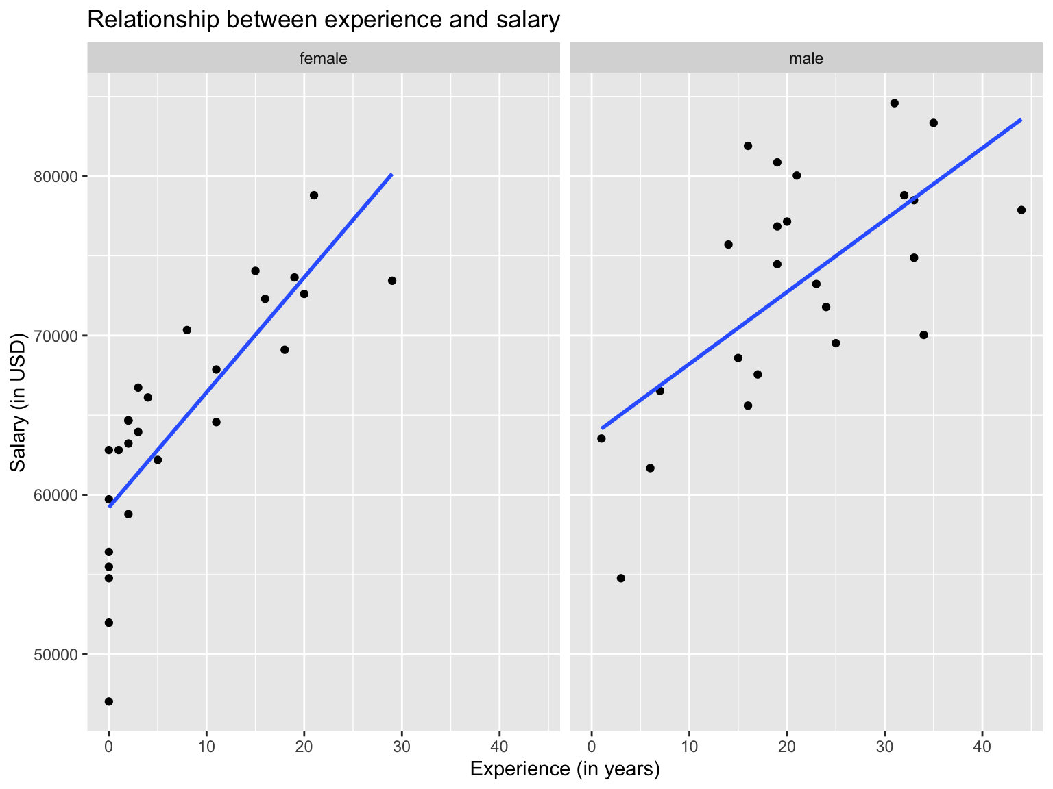
Line Chart
Line charts connect values in the order of x-axis values. This can be very helpful when plotting data over time, like stock prices or comparing values across months.
When using line charts, it is very important to think about the group argument in the ggplot aesthetics, which requires input to a variable for which a value can only occur once. By that I mean, when mapping values across years, days or months will occur multiple times in the dataset and geom_line will have a hard time connecting the dots. Therefore, we need to tell geom_line a grouping, so it connects the dots separately for each year.
In the following example, we don’t require a grouping, as every value is unique. However, we still need to specify the group variable by simply putting group=1, which tells ggplot that no grouping is required.
Let’s assume we have data for bike rentals in London and want to have a look at the average number of rentals per month between 2016 and 2019. In the following section, we will draw a line chart that will display the average rentals per month, computed by using data from 2016 to 2019.
#Compute expected average bike rentals in each month
exp_bikes_per_month <- bike %>%
  filter(year %in% 2016:2019) %>%
  group_by(month) %>%
  summarize(
    monthly_average = mean(bikes_hired)
  )

#Initialize ggplot. If no grouping is required, specify group = 1
ggplot(exp_bikes_per_month, aes(x=month, y=monthly_average, group=1)) +
  #Add line to chart
  geom_line()+
  #Add titles
  labs(
    title = "Average daily bike rentals in London",
    x = "Month",
    y = "Average daily bike rentals"
  )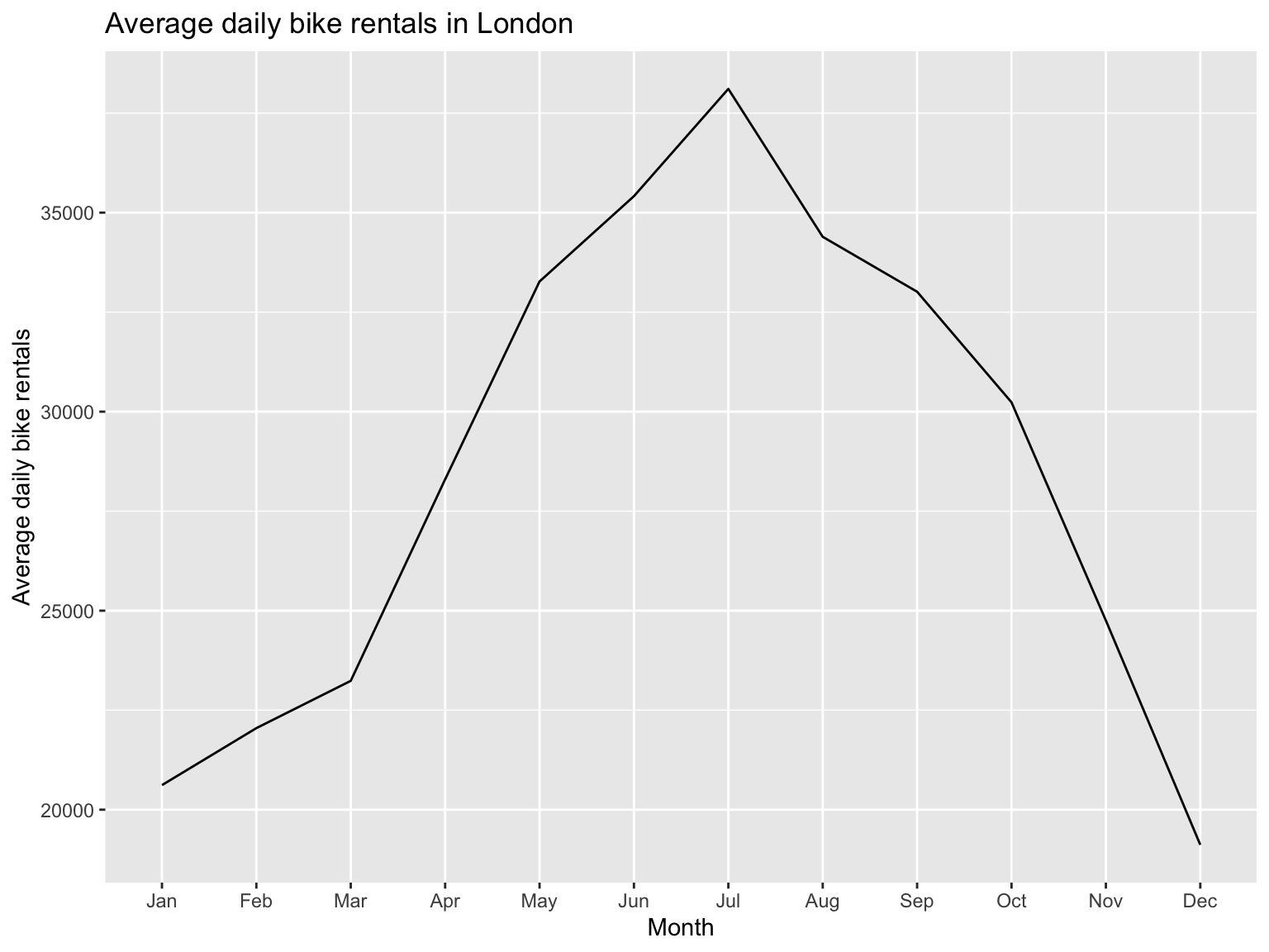
The graph shows us that most bikes are rented in July with more than 37,500 bikes, on average, rented per day.
Bar Chart
Bar charts are often a good alternative to scatter plots when you have a categorical variable and either want to count its occurrence or compare a dependent variable among categories.
As always, we start by initializing ggplot and then add geom_col() if we have a dependent variable or geom_bar() if we only provide one variable and want to count its occurrence. Let’s have a look use cases for both of those examples.
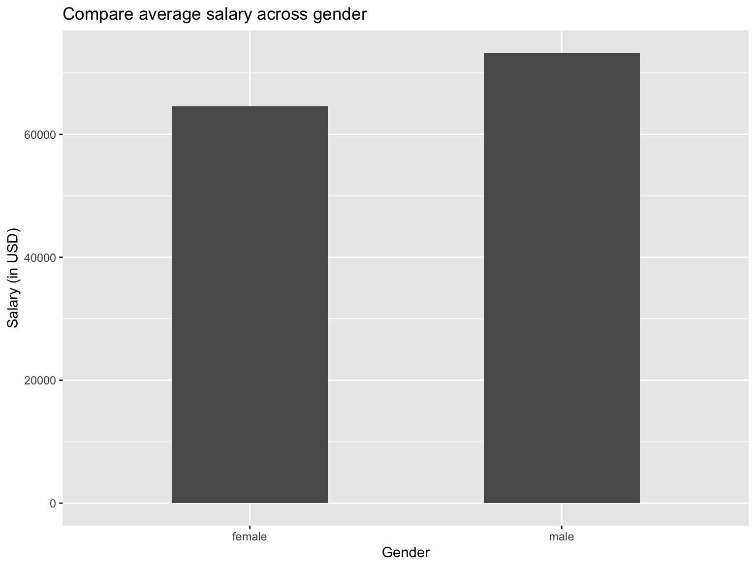
For simplicity reasons, we stick to the initial employee data that was used in the scatter plot section. We start by creating a bar chart comparing the average salary across gender.
Note: In order to plot the graph, we first have to compute the average salary per gender.
#Computing average salary by gender
data_employees_average <- data_employees %>%
  group_by(gender) %>%
  summarize(
    average_salary = mean(salary)
  )
#Initialize ggplot
ggplot(data_employees_average, aes(x=gender, y=average_salary))+
#Specify bar chart. The width of columns can be changed by providing the "width" argument
geom_col(width = 0.5)+
#provide titles
labs(
title = "Compare average salary across gender",
x = "Gender",
y = "Salary (in USD)"
)
If we want, we could also color the bars according to the gender to make it more visual, even though it might not necessarily provide further insights. Naturally, a legend will be created when applying the fillargument to color the bars, but in a bar chart that displays the categorical variables on the x-axis, it might be a good idea to remove the legend by adding theme(legend.position = "none").
The themefunction is generally a very strong function to modify graphs, so if you are interested into further fine-tuning graphs have a look at theme.
Going back to the bar chart, let’s have a quick look at a colored version:
#Initialize ggplot
ggplot(data_employees_average, aes(x=gender, y=average_salary, fill = gender))+
  #Specify bar chart. The width of columns can be changed by providing the "width" argument
  geom_col(width = 0.5)+
  #provide titles
  labs(
    title = "Compare average salary across gender",
    x = "Gender",
    y = "Salary (in USD)"
  )+
  #Hide legend
  theme(legend.position = "none")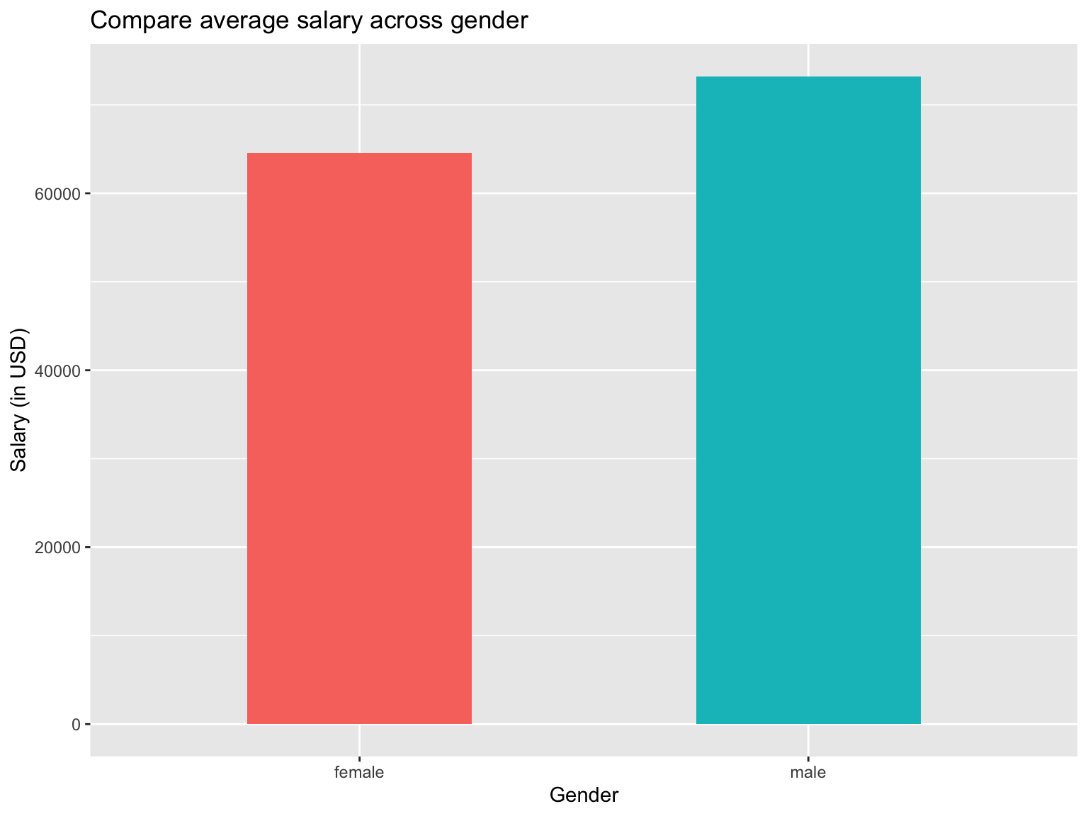
Now that bar charts with x- and y-variables have been addressed, let’s have a look at bar charts that only take a look at one variable and display the number of occurences of that variable. The easiest example is to look at the distribution of gender.
#Initialize ggplot
ggplot(data_employees, aes(x=gender))+
  #Specify bar chart. The width of columns can be changed by providing the "width" argument
  geom_bar(width = 0.5)+
  #provide titles
  labs(
    title = "Distribution of gender",
    x = "Gender"
  )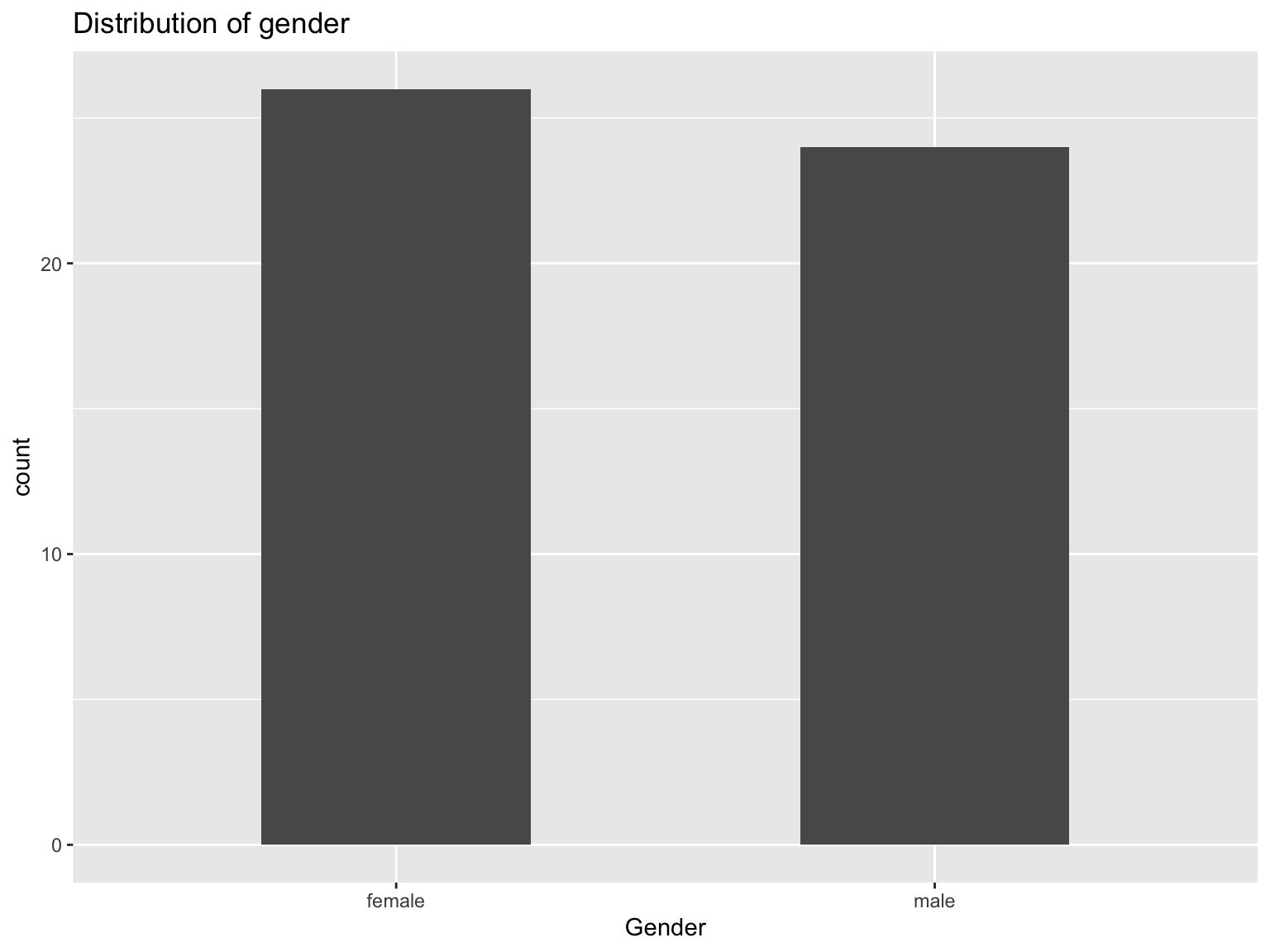
From this graph, we can see that we have slightly more female employees than male employees in the dataset.
Density Plot
If we want to have a look at the distribution of values, we can either use a density graph or a box plot. In this section, we will concentrate on the first option, the density plot.
The density plot provides the distribution of a given variable and provides insights whether a certain distribution is normally distributed or skewed. Going back to the employee dataset, we can analyze the distribution of salary.
#Initialize ggplot
ggplot(data_employees, aes(x=salary))+
  #Plot Density graph
  geom_density()+
  #Add titles
  labs(
    title = "Distribution of salary",
    x = "Salary (in USD)",
    y = "Density"
  )+
  #Expand x-axis to go from 30,000 to 100,000
  expand_limits(x = c(30000,100000))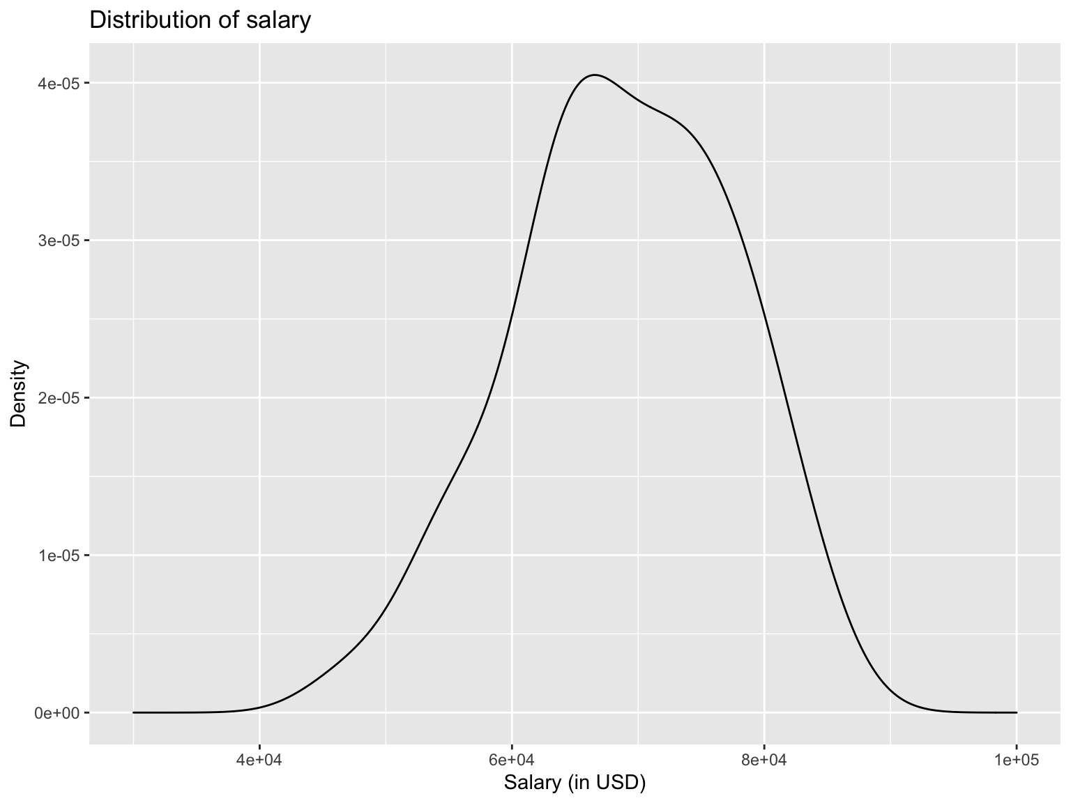
From the graph, we can take that most employees earn between $65000 and $70000 with a slight skew to the left. Without modifying the graph, we didn’t see the endpoints and therefore couldn’t properly analyze the skewness. Hence, I added the function expand_limits to specify the x-axis dimensions myself.
We can do the same density plots by gender, simply by adding fill = genderin theggplot aesthetics. By doing so, it will draw to density plots, one for each gender.
#Initialize ggplot
ggplot(data_employees, aes(x=salary, fill=gender))+
  #Plot Density graph. alpha = 0.3 sets the transparency of the curve
  geom_density(alpha = 0.3)+
  #Add titles
  labs(
    title = "Distribution of salary",
    x = "Salary (in USD)",
    y = "Density"
  )+
  #Expand x-axis to go from 30,000 to 100,000
  expand_limits(x = c(30000,100000))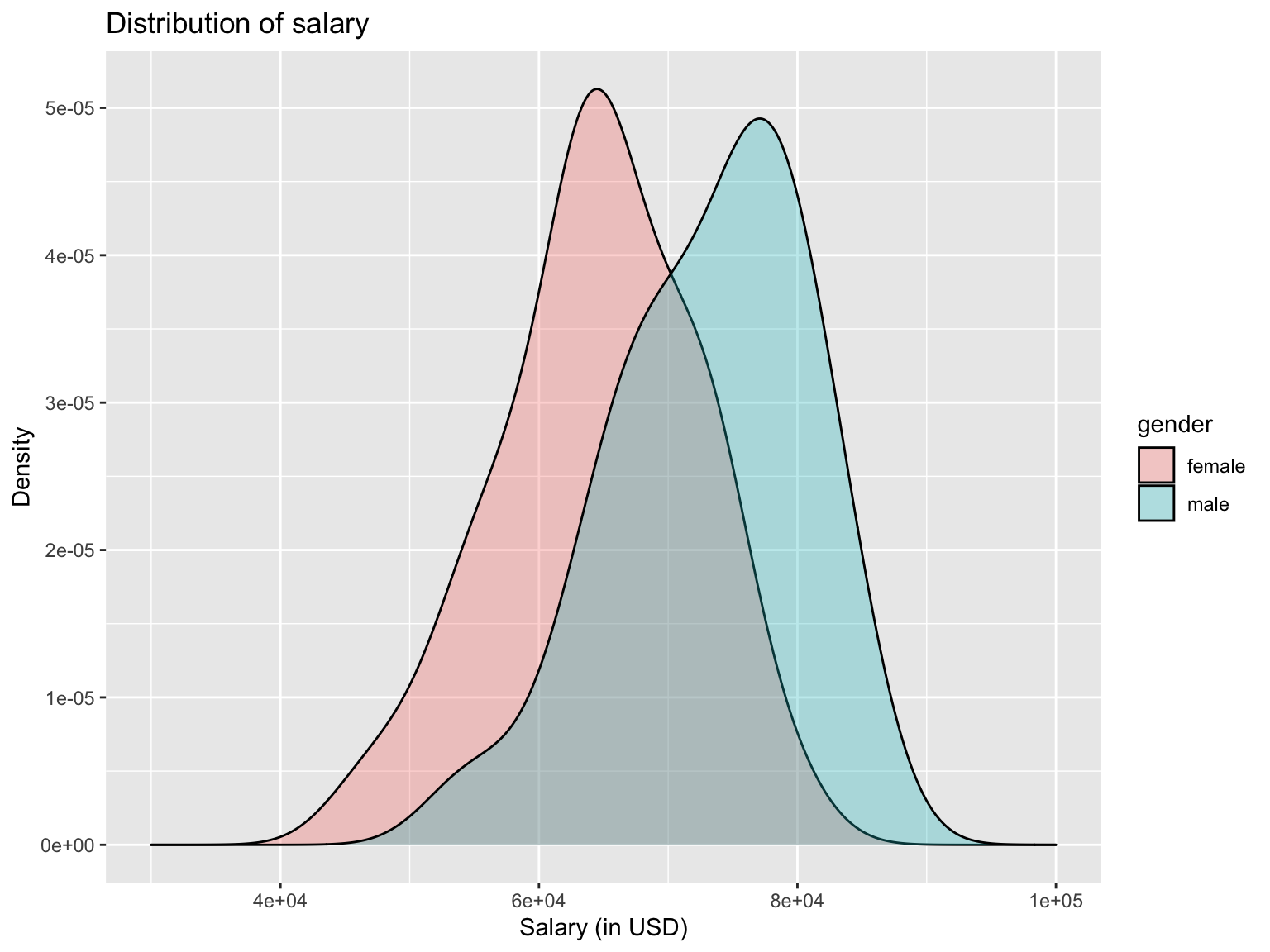
Here, we can see the distribution of salary for more employees is further to the right, implying that male are earning more than female employees.
Box Plot
Similary to a density plot, we can use box plots to visualize distributions. Especially when comparing distributions across a categorial variable, box plots are very useful. In general, box plots display the median as the black straight line in the middle of the box and the upper and lower end of the box are the 75th and 25th percentile, respectively.
Let’s have a look at such graph for the distribution of salary across gender:
#Initialize ggplot
ggplot(data_employees, aes(x=gender, y=salary))+
  #Draw boxplot
  geom_boxplot()+
  #Add titles
  labs(
    title = "Distribution of salary across gender",
    x = "Gender",
    y = "Salary (in USD)"
  )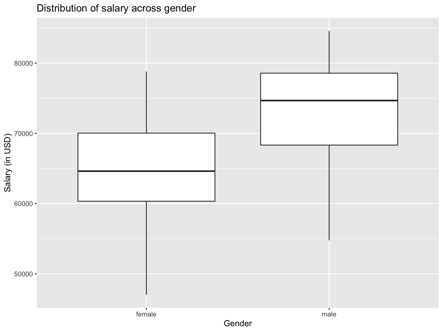
The box plot graph shows us that male employees have a higher median income (ca. $75000 vs $65000), while the 25th percentile of salary for male employees is almost as high as the 75th percentile for female employees. This would be a good basis to conduct further analysis as to why this is the case, as, for example, male employees might have more experience.
Ribbon Plots
Ribbon plots draw areas rather than a point or a straight line. This can be very useful if we want to get a feeling for differences among curves or generall of an interval of values.
If we recall the monthly bike rentals that we looke at in the geom_line section, we can make this graph even more sophisticaed. We could look at how much the monthly bike rentals deviate from the average over the past few years. In that case, we could use geom_ribbon to color the difference between the average monthly rentals and the actual rentals in that month.
Note: This is a more sophisticated analysis that required data preparation. In addition, several elements, such as themehave been added for visualization purposes. The full analysis can be found here: Effect of Covid-19 on Bike Rentals
#Compute expected average bike rentals in each month
exp_bikes_per_month <- bike %>%
  filter(year %in% 2016:2019) %>%
  group_by(month) %>%
  summarize(
    monthly_average = mean(bikes_hired)
  )
#Compute actual average bike rentals per month
actual_bikes_per_month <- bike %>%
  filter(year>=2016) %>%
  group_by(year, month) %>%
  summarize(
    act_monthly_average = mean(bikes_hired)
  )
#Merge actual and expected bike rental in one dataframe
bikes_per_month <-
  left_join(actual_bikes_per_month, exp_bikes_per_month, by="month")

#Compute discrepancies in actual and expected bike rentals
bikes_per_month <- bikes_per_month %>%
  mutate(
    excess_rentals = act_monthly_average - monthly_average,
    #If actual bike rentals are higher than average
    up = ifelse(act_monthly_average>monthly_average, excess_rentals, 0),
    #If average bike rentals are lower than average
    down = ifelse(act_monthly_average<monthly_average, excess_rentals, 0)
  )

#Initialize ggplot
ggplot(bikes_per_month, aes(x=month, group = year))+
  #Draw a line for the actual number of monthly rentals
  geom_line(aes(y=act_monthly_average),size=0.4, color="#333333")+
  #Draw a line for the average monthly rentals
  geom_line(aes(y=monthly_average), size=1, color="blue") +
  #Draw a separate graph for each years
  facet_wrap(~year)+
  #Apply white background
  theme_minimal()+
  #Draw green areas if actual rentals are higher than average
  geom_ribbon(aes(ymin=monthly_average,ymax=monthly_average+up),
              fill="#7DCD85",alpha=0.4)+
  #Draw red areas if actual rentals are lower than average
  geom_ribbon(aes(ymin=monthly_average+down,ymax=monthly_average),
              fill="#CB454A",alpha=0.4)+
  #Add titles
  labs(
    title="Monthly changes in TfL bike rentals",
    subtitle="Change from monthly average
shown in blue and calculated between 2016-2019",
    y="Bike rentals",
    x="",
    caption = "Source: TfL, London Data Store"
  )+
  #Adjust size for title and axes
  theme(plot.title = element_text(size=14),
        plot.subtitle=element_text(size = 12),
        axis.title.y = element_text(face="bold", size=10),
        axis.text.x = element_text(size=9),
        axis.text.y = element_text(size=10),
        plot.caption = element_text(size=8),
        strip.text = element_text(size=8)
        )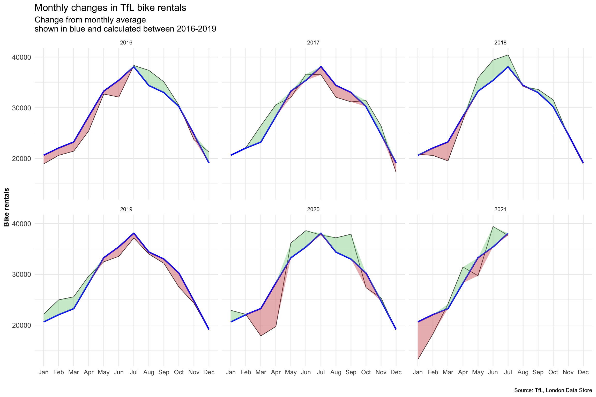
The graph clearly shows us when actual monthly rentals are higher than the average measured between 2016 and 2019 by coloring the surplus green, and coloring areas read where actual rentals are below the average. It is very visually appealing and easily interpretable.